Increasing course completion rates on an e-learning
platform for early stage freelancers
Brief
We were tasked to improve user engagement and retention rates on an e-learning course for freelancers within the company’s Saas platform.
My Role
I was charge of conducting UX research. developing wireframes, creating high fidelity mock ups and handing over final work to the developers.
Company UnderPinned
Tools Figma, Jira, Slack, Whimsical & Otter.ai
Team
Lead Product Designer (me)
Two product owners
Developer team
Process
We broke this project down into a series of steps consisting of
the below sequence:
01 — Discover: stakeholder interviews, competitor research & user interviews
02 — Define: Analyse the results
03 — Develop: Initial wireframe sketches, low-fidelity wireframes & testing
04 — Deliver: High-fidelity designs & developer handover
Stakeholder interviews: Defining the problem
The platform was having a steady, consistent rate of new users signing up for the platform through successful marketing campaigns targeting early stage freelancers.
However, through reviewing user data and interviewing key members of the team within sales and marketing we discovered many were not even starting the online course they had paid for let alone completing it.
Setting off a chain of negative results for the company:
What?
We invited them to look at the current
e-leaning courseObserving how they navigated through the current educational course and noted down
any key points of interest/ pain points.
Through initial stakeholder interviews, one of the key company goals was to build consistent revenue through long term subscribers and reduce drop out rates.
Competitor Research
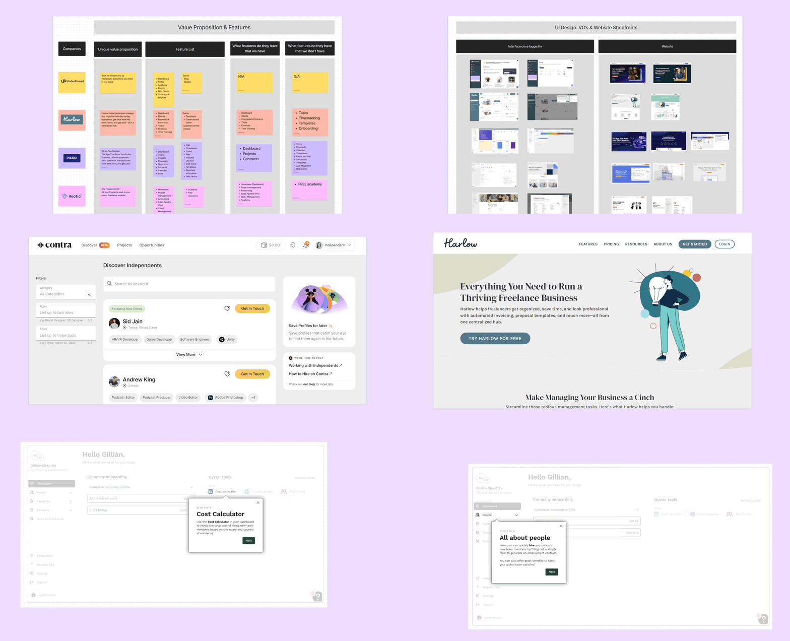
In order to gain a wider understanding of what was already out there in the market we conducted a quick analysis of three of the company’s primary competitors:
Contra, Plutio & Hectic. I researched:
The competitor features and compared them to UnderPinned’s offering.
UI layouts particularly any educational features and ease of use.
We found the key aspect which made UnderPinned stood out against their competitors was their Educational offering in terms of their courses, live events and coaching for early stage freelancers.
Which aligned with the company goal of retaining users through a unique value proposition and then in turn encourage them to utilize the full suite of tools within the program which included project management and finance for freelancers.
User Interviews
For the next stage in our research phase we conducted a series of remote user interviews using otter.ai to easily collate the information. With the goal of understanding the current frustrations of the users, identify their pain points and key motivations.
Why?
We interviewed early stage freelancers primarily in the creative industries
We chose to interview ex-participants of the course to get a good feel for existing pain points. And new freelancers out with the course to get a balanced viewpoint.
Key takeaways
Time constraints:
The videos were too long. And so users felt they didn’t have enough time to watch a 30-40 minute video then complete a long worksheet.Navigation
Videos were hard to find and there was no marker to show which videos had been watched.
The users needed to easily access the right video for them and have an incentive to watch ie properly signposted and marked when done.Feelings of overwelm
Many early stage freelancers were juggling multiple jobs at once. They felt the navigation was confusing, the colours were a little bright and overall didn’t help to convey a sense of calm or organisation for them.
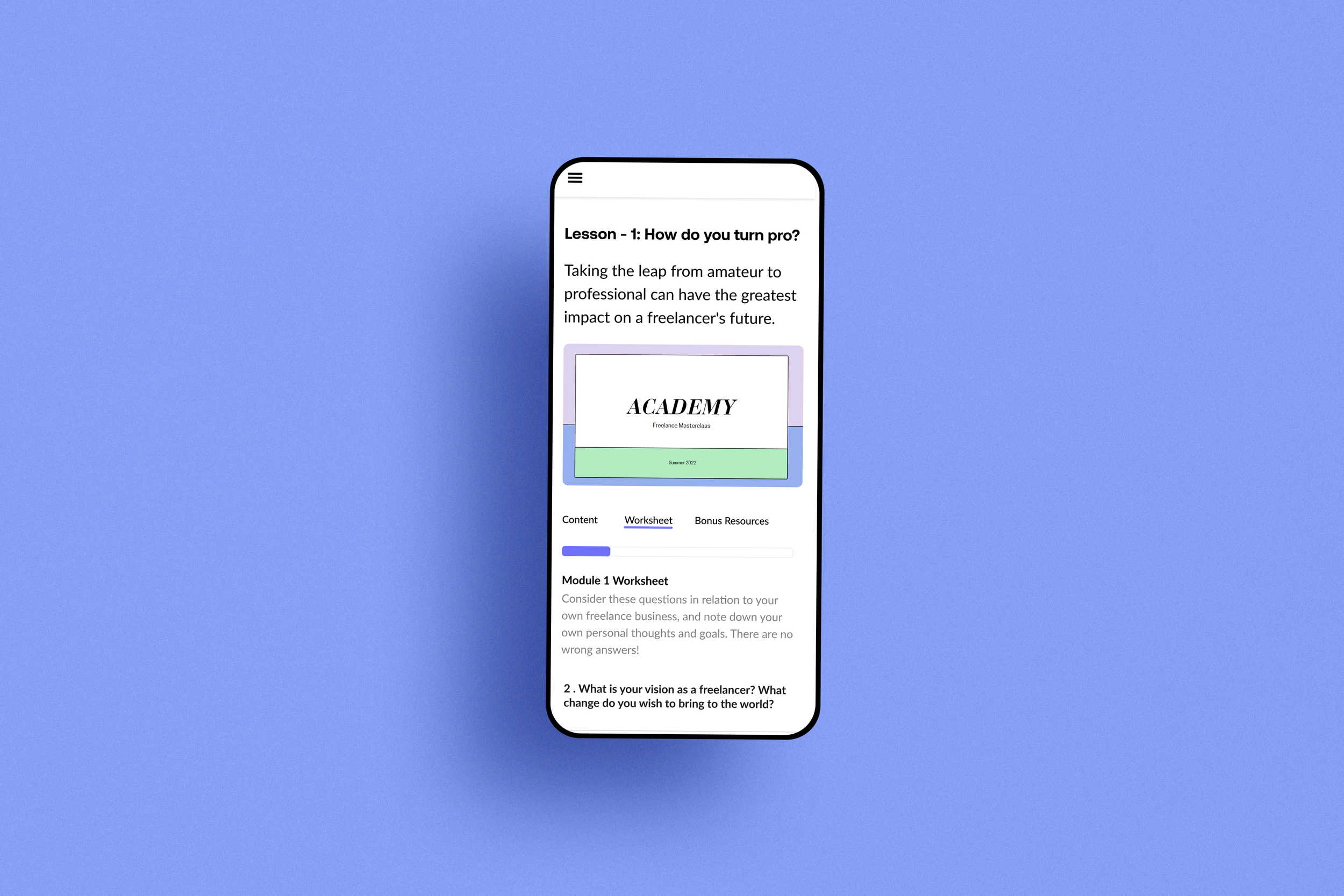
The colours were perhaps a little on the young side too. The users needed to feel the course was helping them to organise and structure their freelance business. See below a slide from the current course from our audit:
Next, I worked on the high-fidelity designs and annotating all flows for the developers.
Once I finished building an early stage prototype, we carried out some further Usability Testing to gather feedback on the early stages of the design and showed the wireframes to the developers.
In order to further understand the scope and potential restraints of the project.
From Sketch to High Fidelity
I then created some early stage low fidelity wireframes to improve the flow for the user from dashboard to inside the course.
Working closely with the engineers to validate the designs at each stage and handover the high fidelity designs for development.
04 — Deliver: High-fidelity designs & developer handover
Results
The platform saw an increased rate on users completing the course, through improved navigation and signposting which also reduced drop offs.
Furthermore, the course included cross-links at multiple points to other features within the platform, which helped to increase activity across the site.
Next steps:
1. Adding onboarding to the platform to further encourage users to explore the rest of the system once they complete the course with the aim of further reducing drop offs and increase the site’s retention rate in terms of user subscriptions.
2. Further user testing on the site to explore the case for developing into mobile. Ie explore how many freelancers were using the system whilst on the move, to increase activity across the platform and retain users.


